7M Workout
7M Workout is a fitness app designed by the Johnson & Johnson company. I chose this app to do the case study because I wanted to practice from UI/UX standpoint and explore ‘glassmorphism’ style.
7M Workout
7M Workout is a fitness app designed by the Johnson & Johnson company. I chose this app to do the case study because I wanted to practice from UI/UX standpoint and explore ‘glassmorphism’ style.
Problems and solutions
This case study focused on both the UI and UX of the app to upgrade the user experience. The problems and solutions are:
• Overuse of capitals
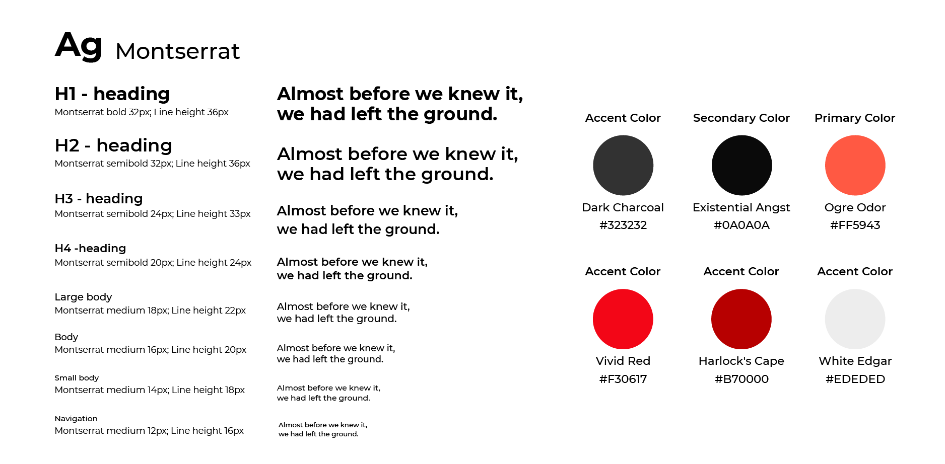
All the words are capitalized in this app, causing readability problems. The typeface is also not easily legible on the mobile platform. Therefore, I used a different typeface and applied type scales to generate hierarchy.
• Confusing UI
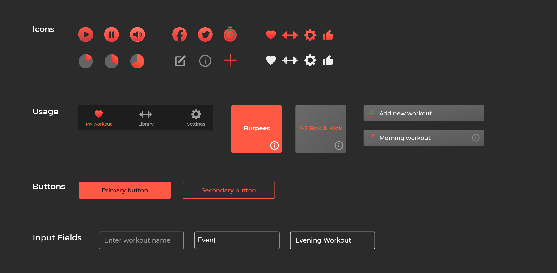
The branding colour is overused in the app. When I looked at the app, I didn’t know where should I click. There are no different states for UI components, making users confused. Lots of padding and margin issues are identified in the current design, so the app looks visually unbalanced.
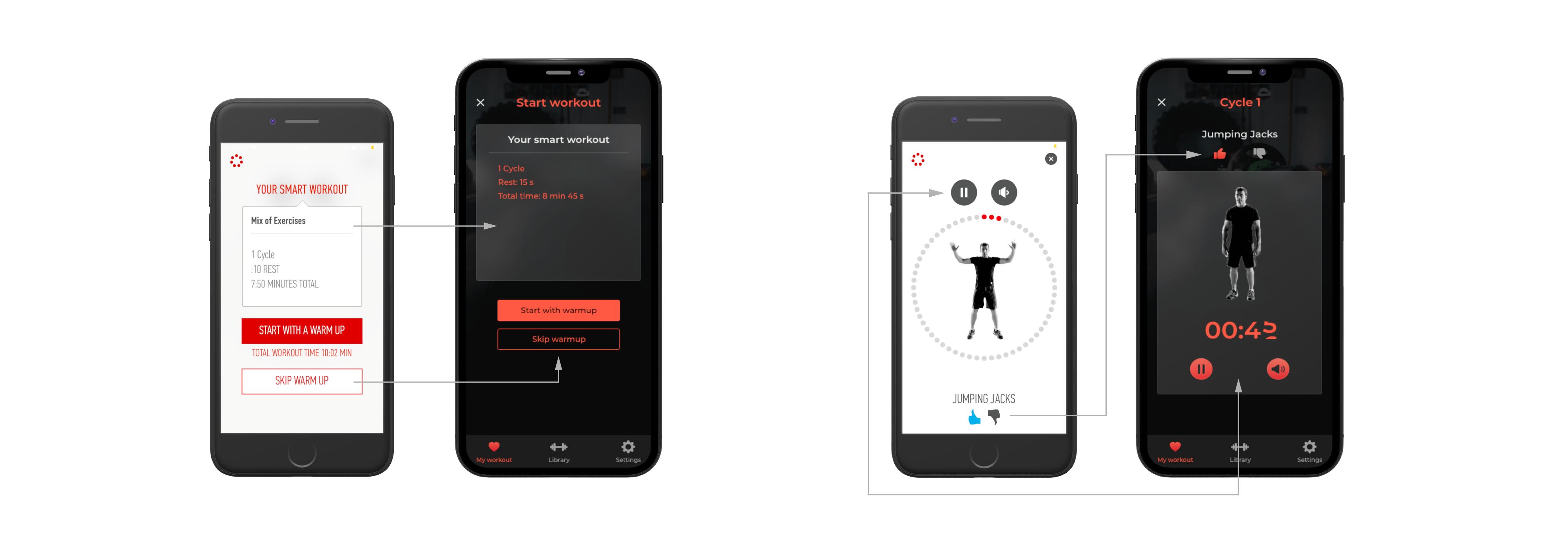
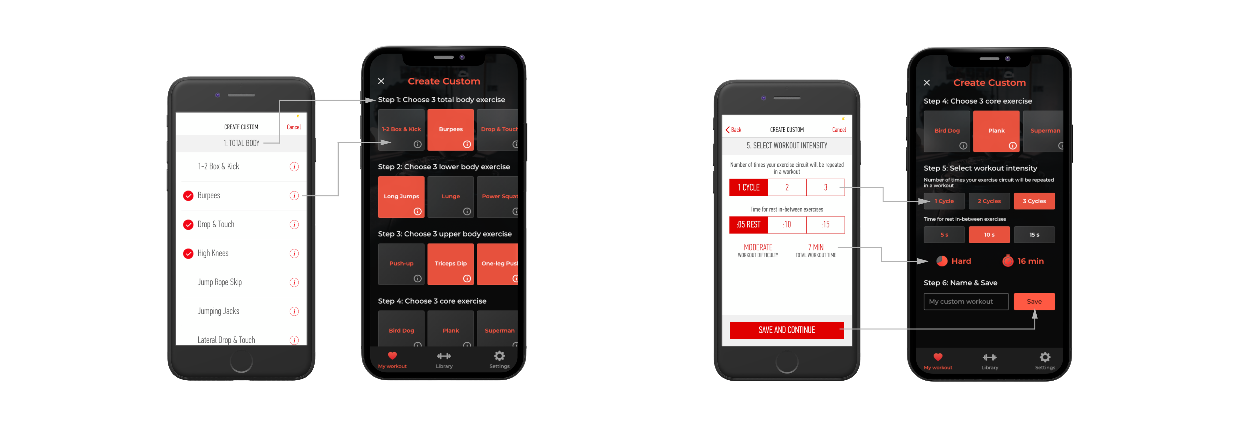
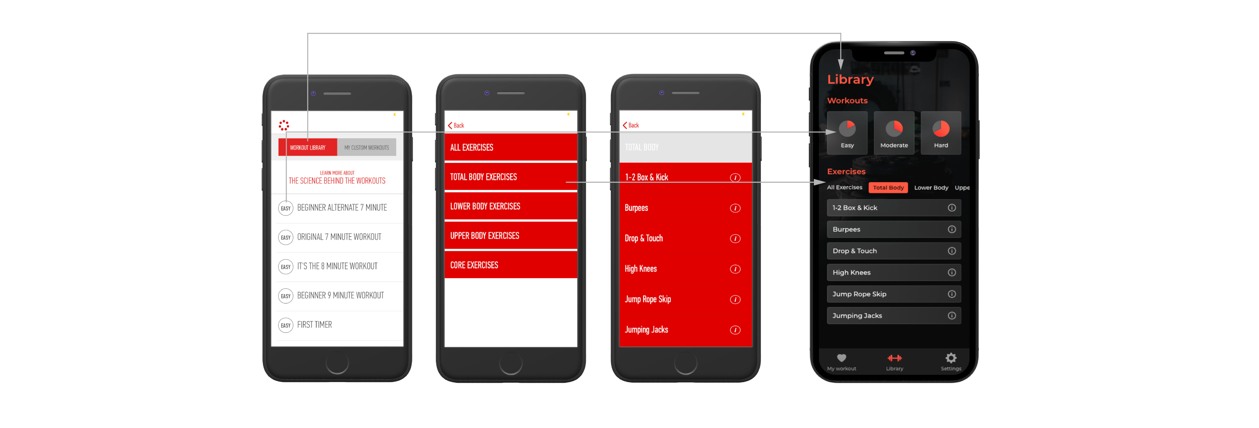
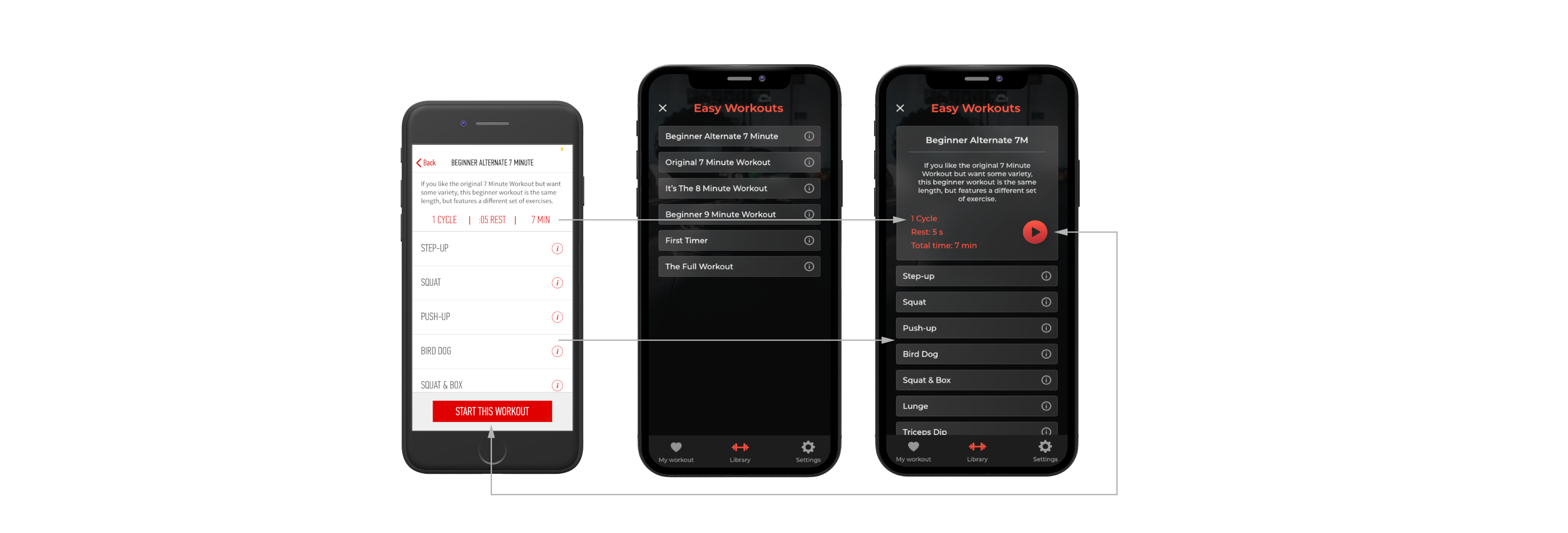
• Chaotic UX
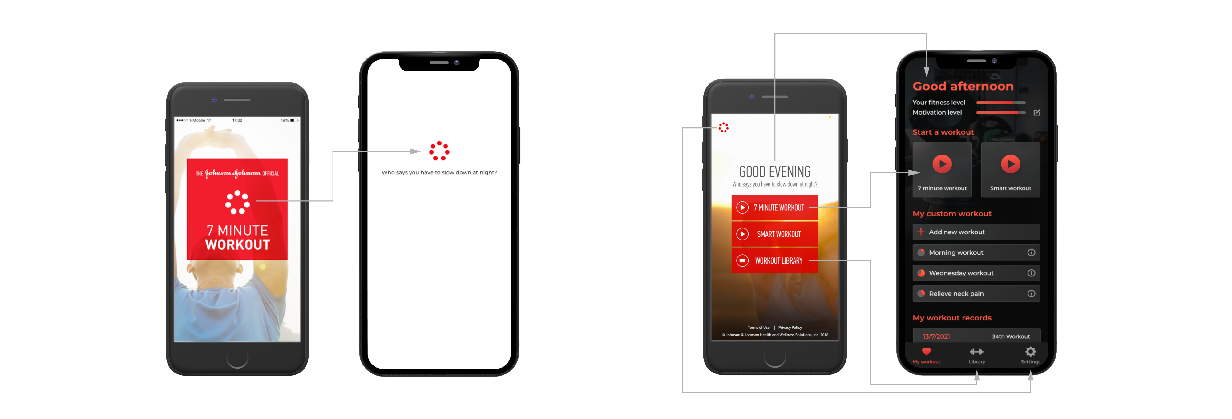
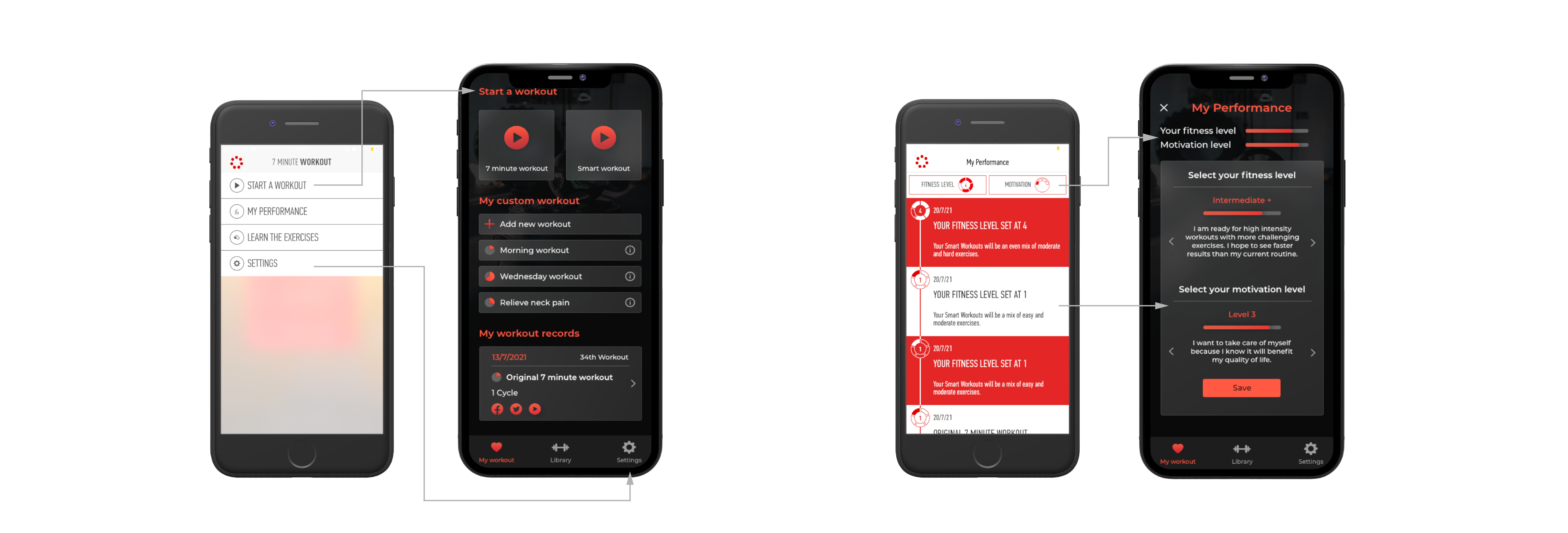
I changed the user flow to make it more smooth and logical. For example, the permanent menu located on the top left corner breaks the whole UX and stops users from getting back to the previous screen, so I added a bottom navigation and moved several functions.
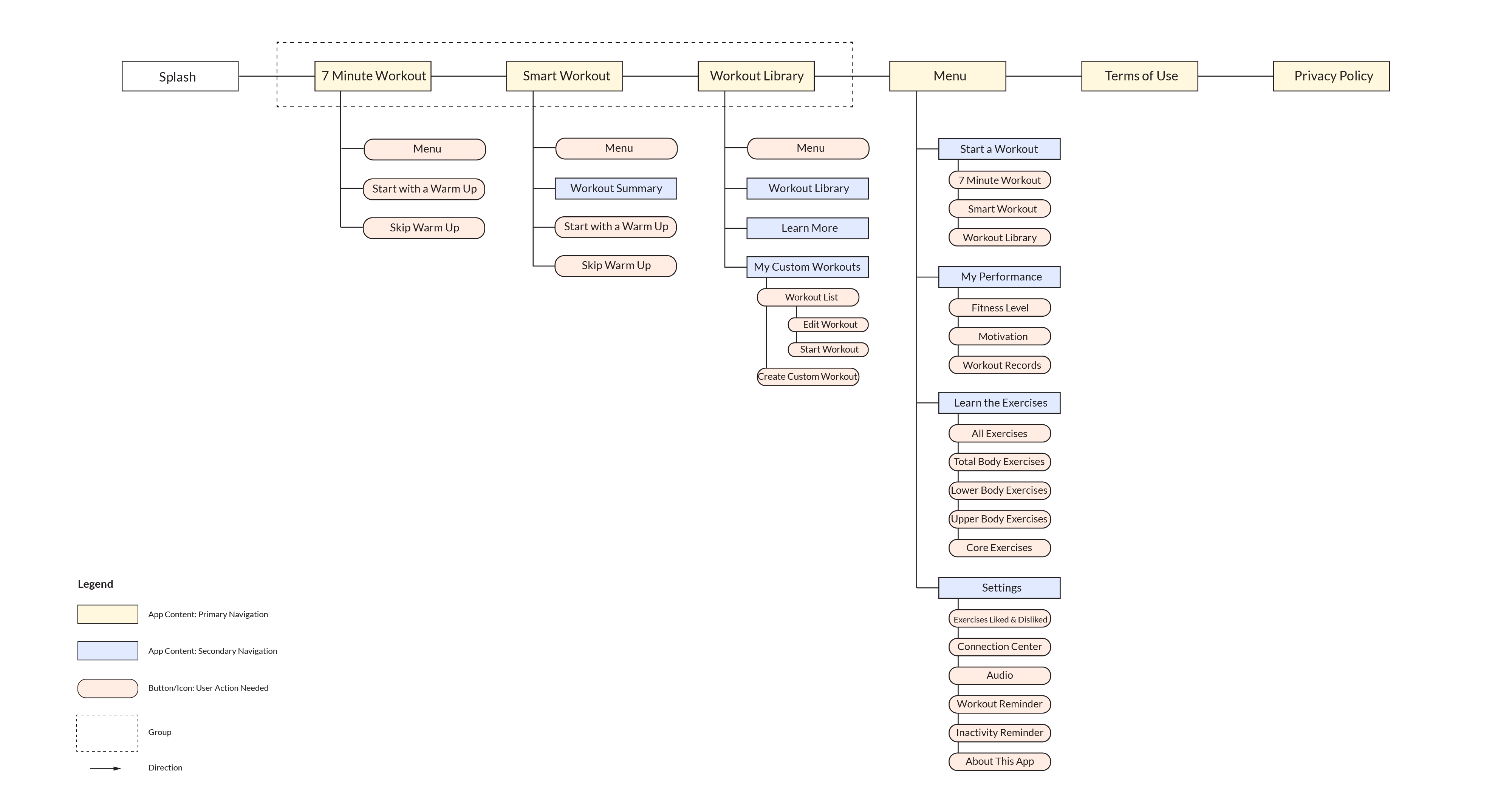
Current user flow
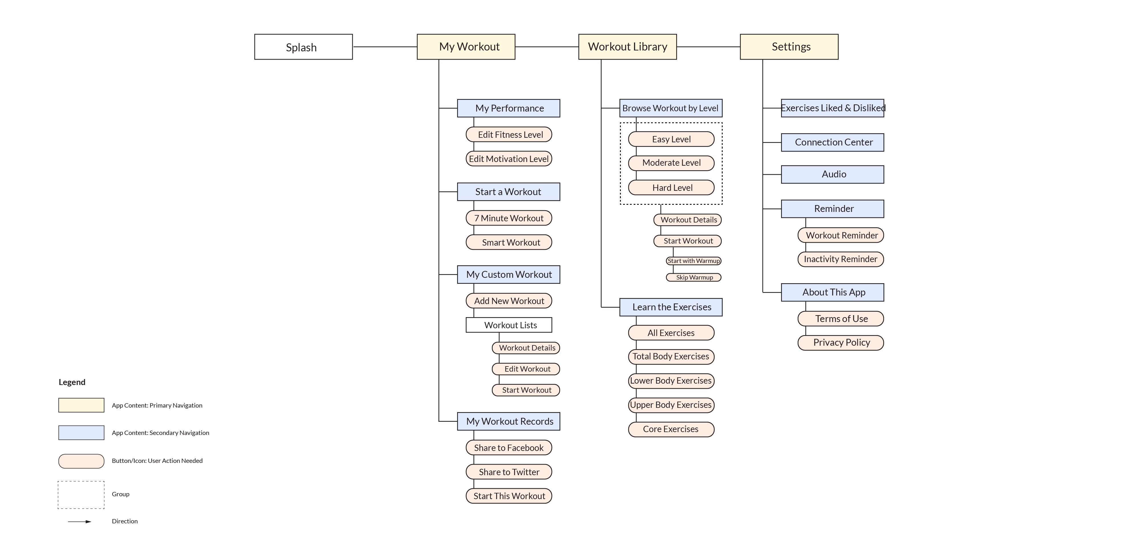
New user flow
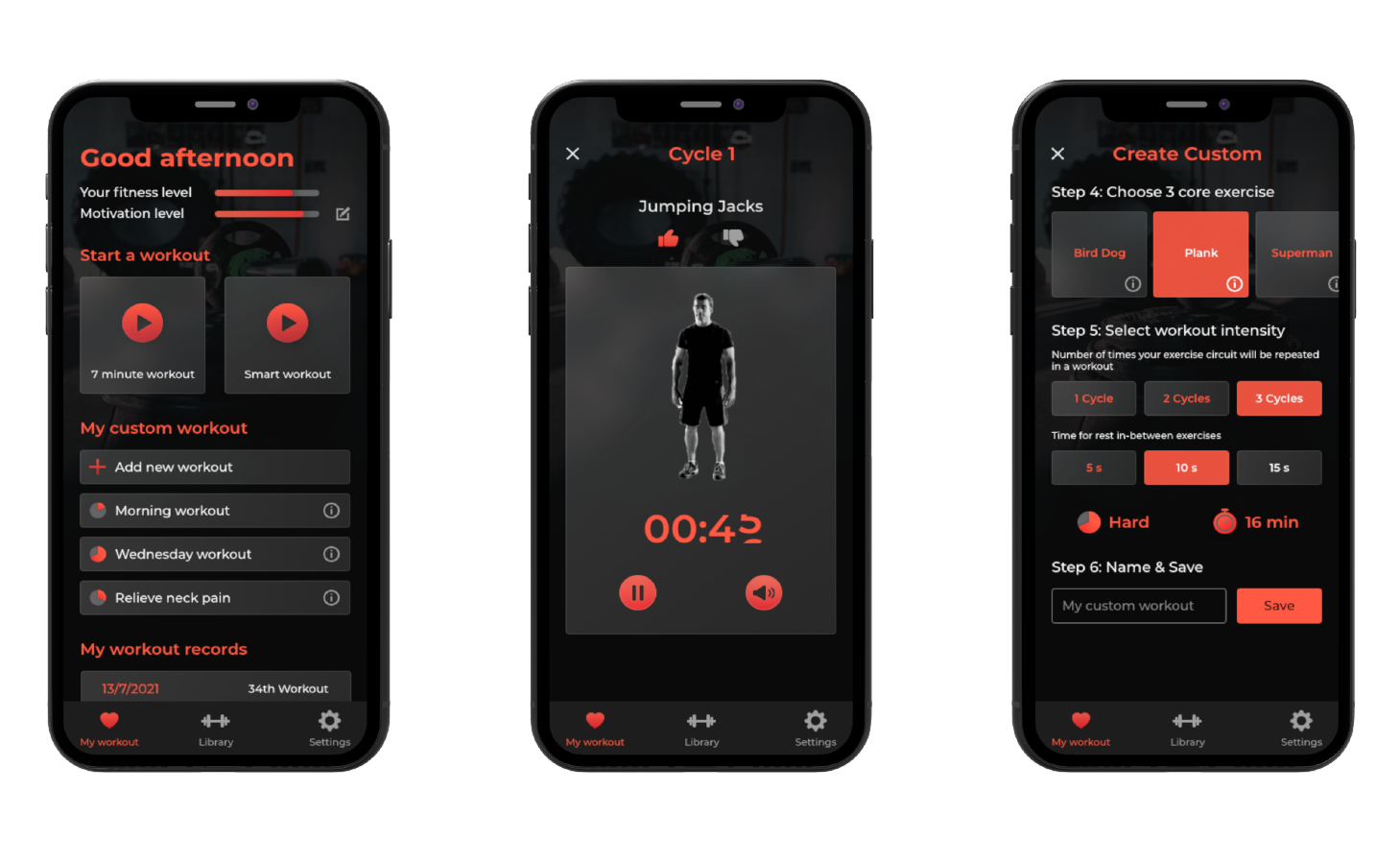
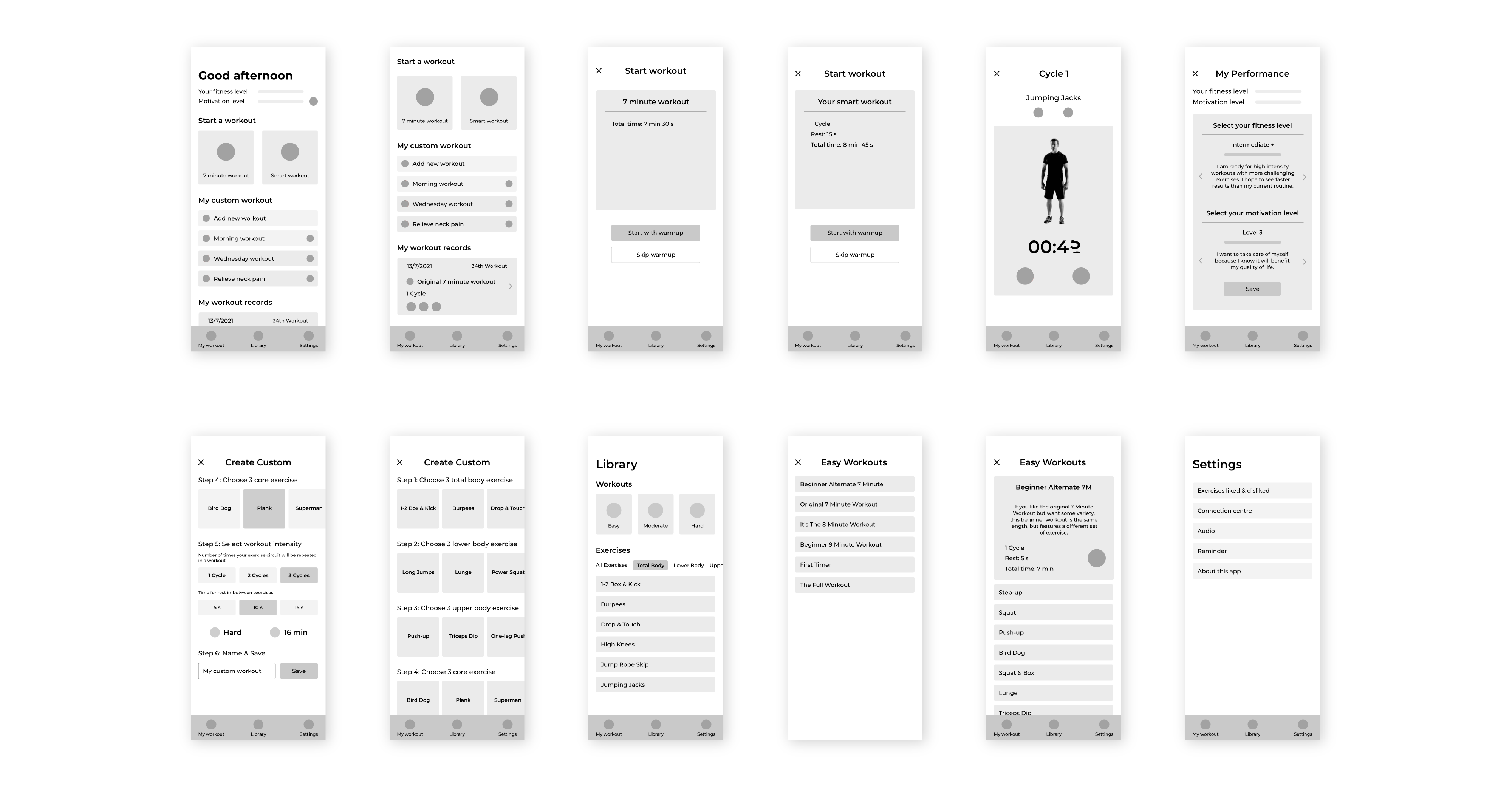
New wireframes
New UI kit
Current app VS My redesign
Tools used

Back to top