Studentcare
The website provides students with information regarding their health insurance. This case study focuses on redesigning the current UI to create a better user experience.
Studentcare
The website provides students with information regarding their health insurance. This case study focuses on redesigning the current UI to create a better user experience.
Problem analysis
Studentcare is a website with heavy content, but the current design doesn’t highlight the hierarchy. Thus, users are easily lost and cannot find the information they want. The main problems are:
• Cluttered navigation bar
• Overuse of colours
• Disordered layout
• Unexpected button and link behaviours
• Some font sizes are too small
My solution
To solve those problems, I made some changes to the UX. For example, I integrated scattered links and buttons into a more organized navigation bar so that the users can browse the website more easily. Some call-to-action buttons were added to help the users explore the website.
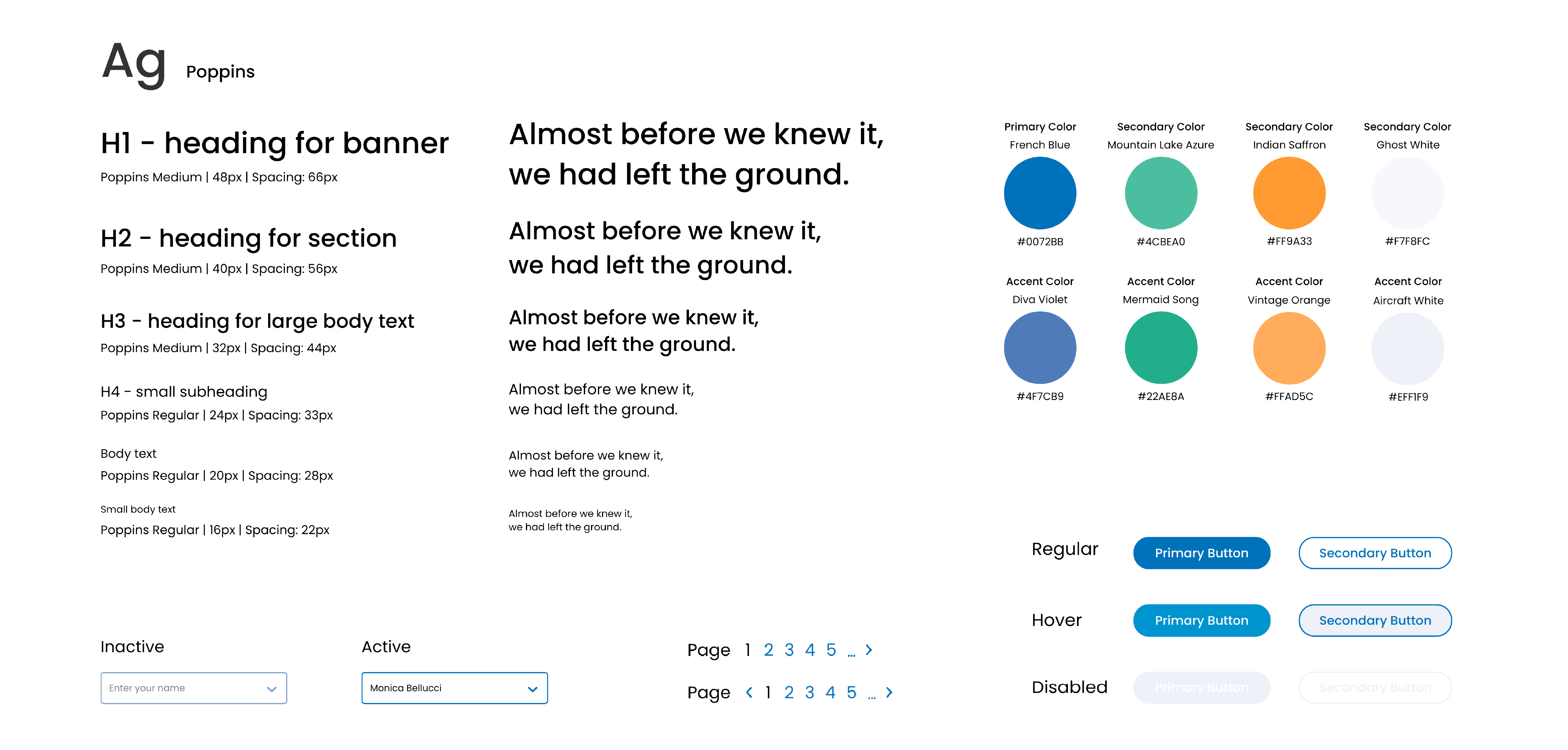
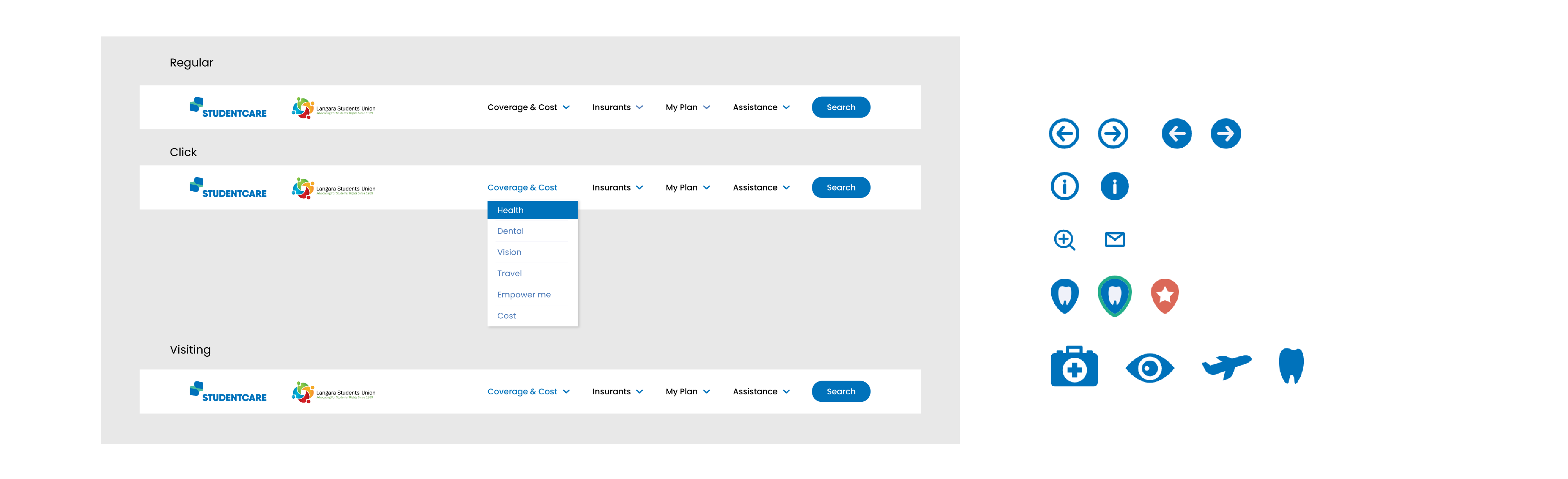
As for UI, I created a kit for the website. I chose a more legible typeface and integrated a proper type scale to ensure the readability and hierarchy of the text content. I designed different buttons and input field states to use on each page in order to keep consistency. I also reduced the use of colours to keep the design clean and fresh.
New UI kit
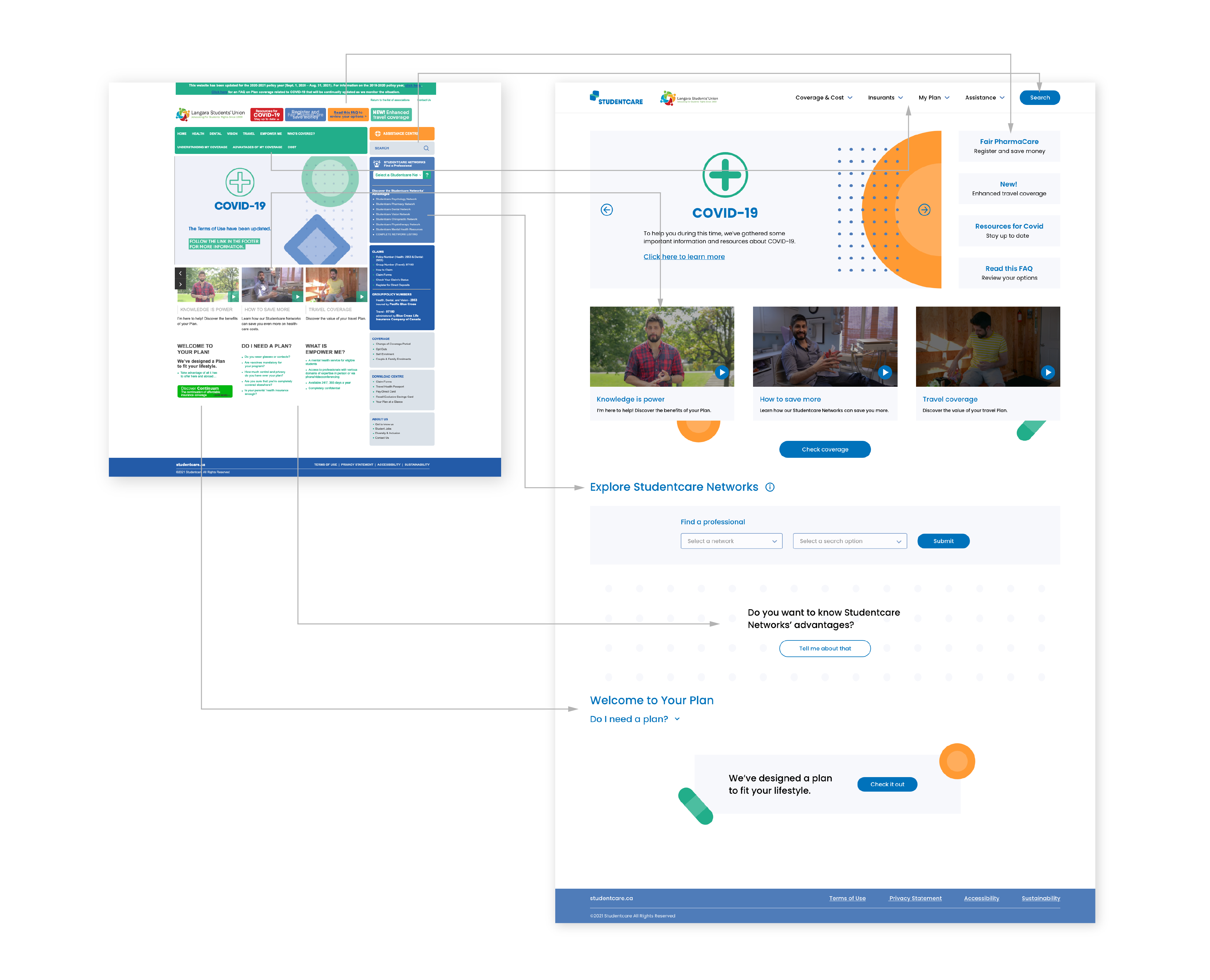
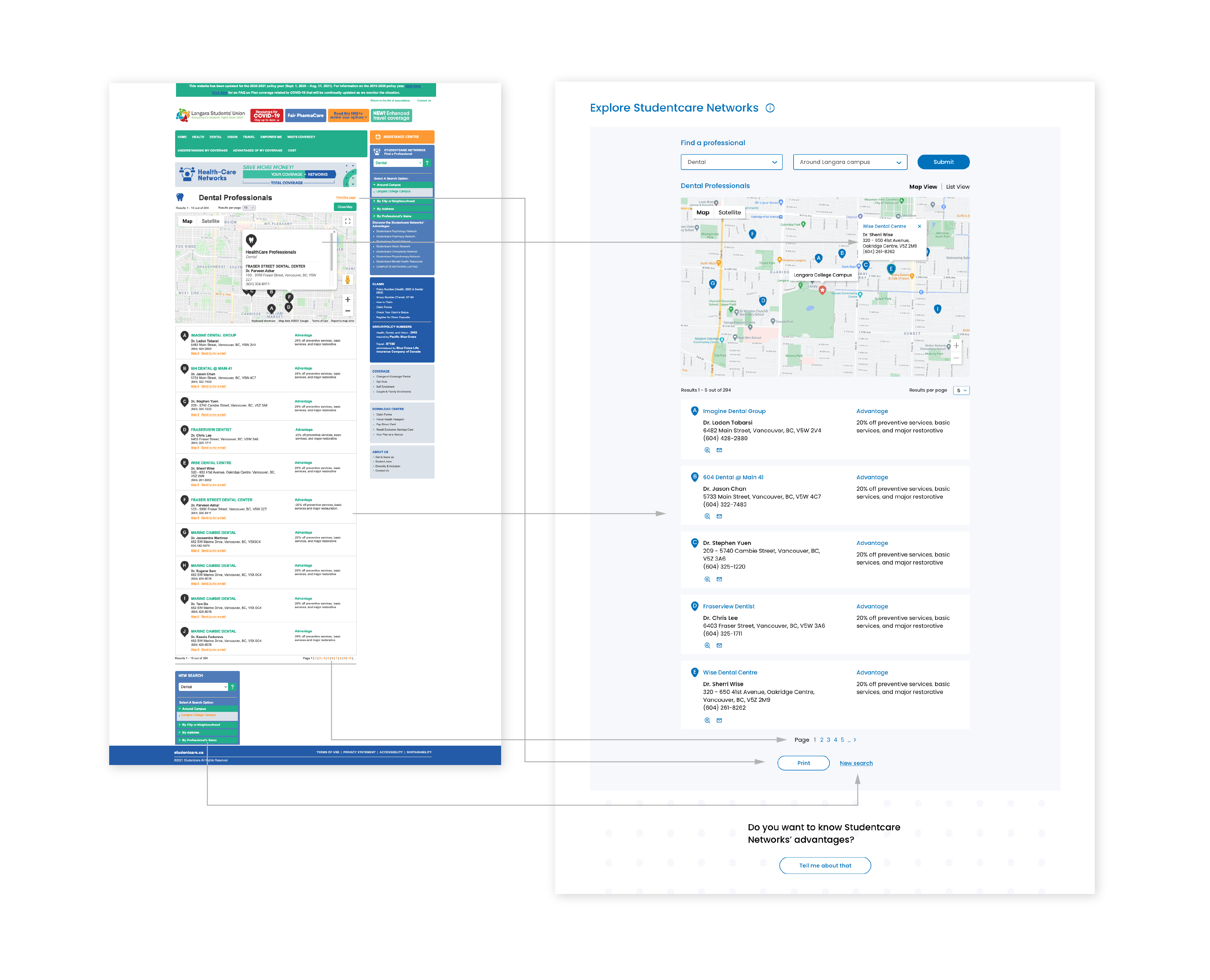
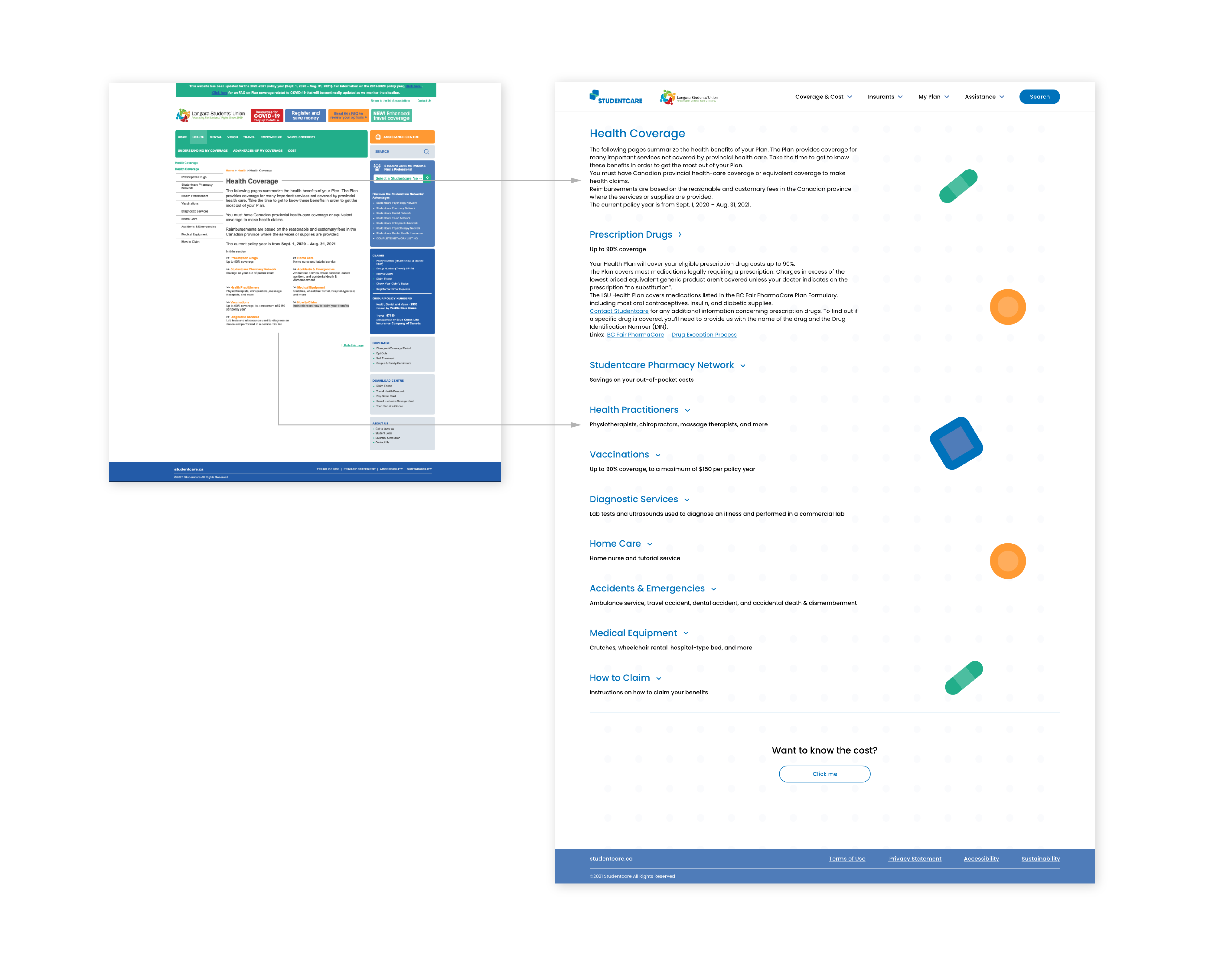
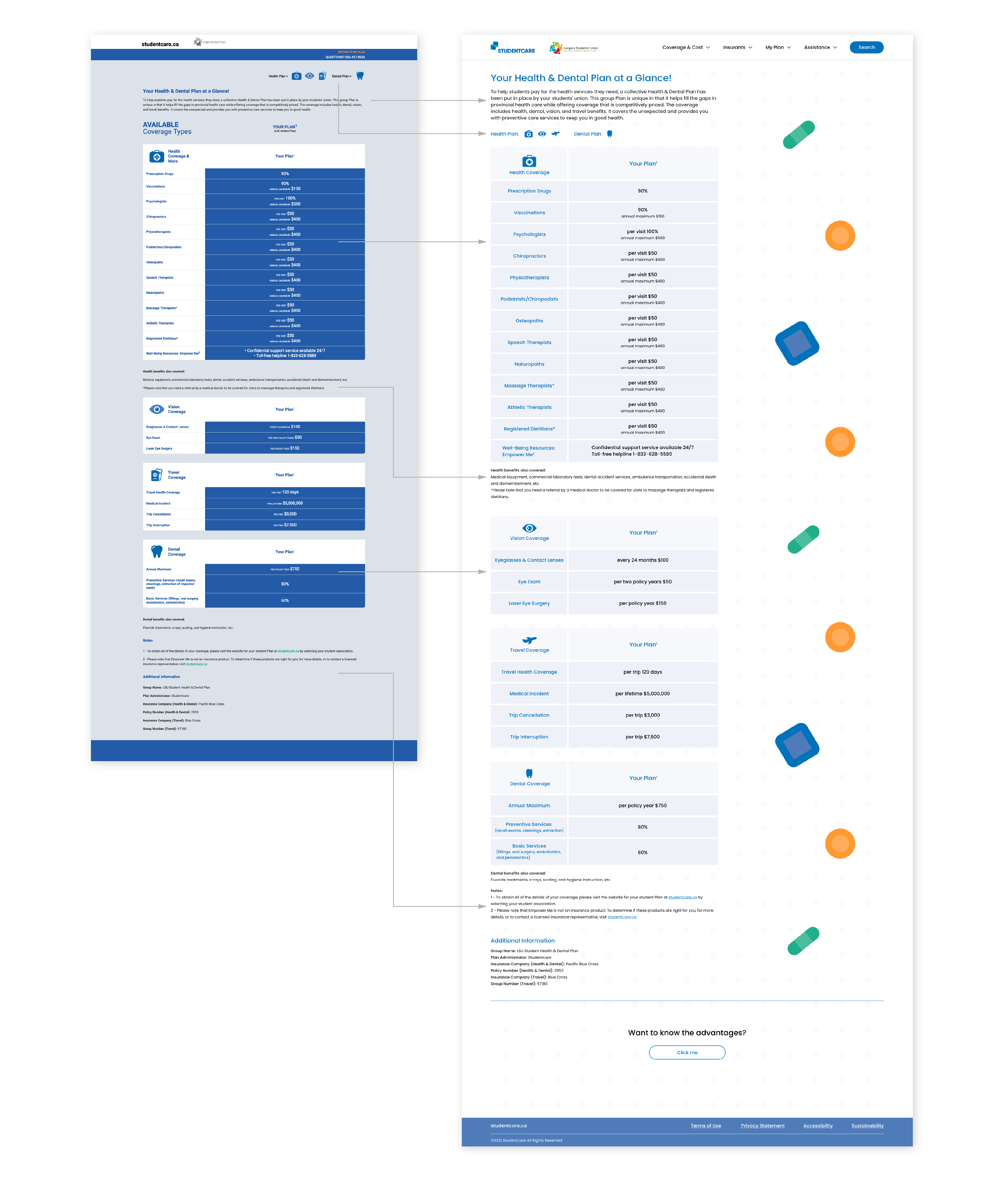
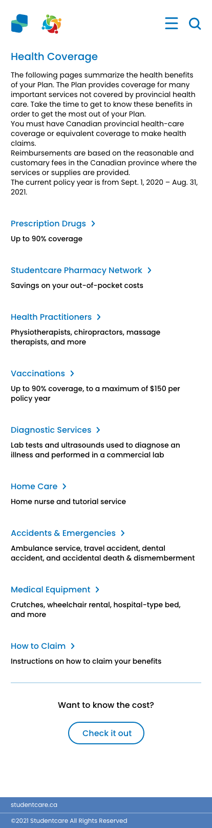
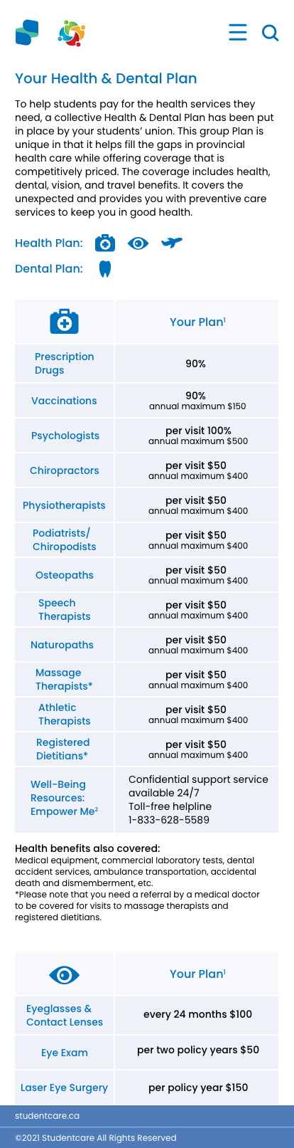
Current website VS My redesign
The previous design is pretty chaotic, especially the navigation section, so my goal is to make the website clean and easy to use. I made these changes:
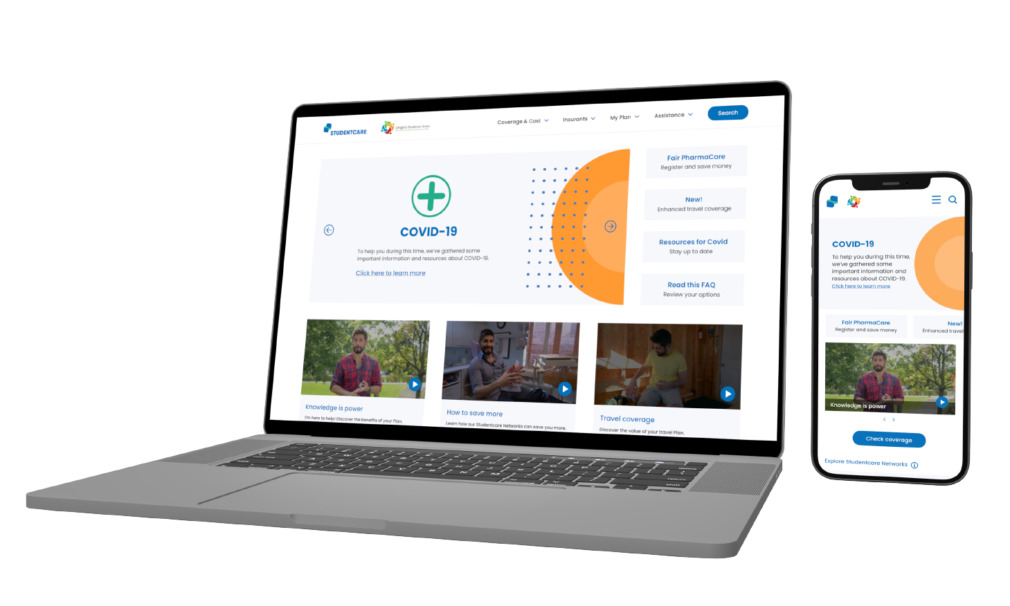
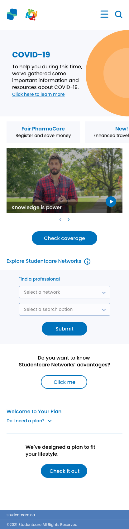
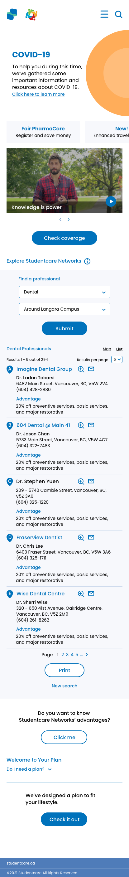
Mobile screens
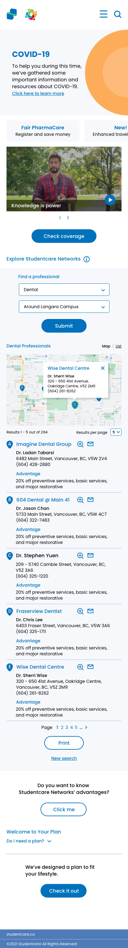
The current Studentcare website is not responsive, so users can’t visit the website using mobile phones.
Current mobile view

My responsive design
Tools used

Back to top